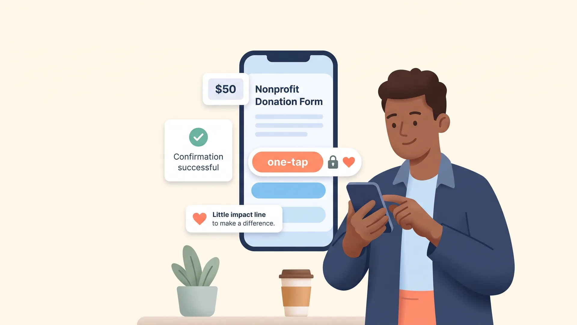
TL;DR: Donation page optimization is not a design detail. For donors who never see your work in person, the giving experience is the moment trust becomes a gift. A fast, mobile-first, transparent giving flow that confirms where the money goes is what turns a warm supporter into a donor, and a first gift into a second.
Picture a supporter who has followed your cause for months. They have read your emails, watched a story on their phone, and finally decided to give. They tap "Donate." And then they wait. The form asks for information they do not have handy. It does not offer the payment method they use for everything else. A small voice asks, "Is this even secure?" That pause is where a lot of giving dies.
Most conversations about fundraising focus on the ask. Fewer focus on the ten seconds after someone says yes. Yet that is exactly where donor trust is won or lost, and it is why donation page optimization deserves a seat at your strategy table, not just your web developer's to-do list.
This matters even more for donors who support causes they will never witness firsthand. When someone cannot drop by your office, tour your program, or shake your hand, your giving experience carries the full weight of proving you are real, capable, and worthy of their money. The screen is the handshake.
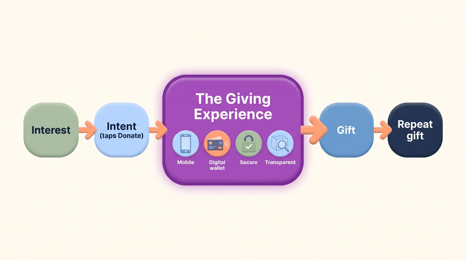
Why is the online giving experience where donor trust is won or lost?
Because trust is the gate every gift has to pass through, and the donation page is where donors decide whether to open it.
The trust gap is real and measurable. According to the BBB Give.org Donor Trust Report, only 18.3 percent of U.S. adults say they highly trust charities, while 67.7 percent say trust is essential before they will give. Read that again. Two-thirds of your potential donors are actively looking for a reason to trust you before they part with a dollar, and most of them start out skeptical.
Trust does not just decide whether people give. It decides how much. Earlier Give.org research found that 53.2 percent of high-trust donors gave more than $200, compared with 39 percent of low-trust donors, and that donors who place high importance on trust gave at noticeably higher rates than those who did not.
When you earn trust, you do not just get the gift. You get a bigger one.
Now think about where that trust judgment actually happens. A donor cannot audit your financials in the moment. They cannot call a board member. They are standing at your donation page with their thumb hovering over a button, reading the room in seconds. Every friction, every unfamiliar step, every "why does it look like this" reads as a small risk. A clean, confident giving experience reads as safety.
This is the heart of what we call Smart Stewardship: treating every donor interaction, including the transaction itself, as a relationship moment rather than a mechanical one. The gift is not the end of cultivation. It is a cultivation touchpoint of its own.
How do I design a donation page that drives giving?
Start by removing reasons to hesitate. A donation page that drives giving is fast, focused, and free of surprises. It answers the donor's unspoken questions before they have to ask them.
Here is what that looks like in practice for a development team optimizing an existing giving flow, not building a first page from scratch:
- Cut the form down to what you truly need. Every extra field is a reason to abandon. Ask for the gift and the essentials, and save the rest for later stewardship.
- Keep the donor on your brand. A page that suddenly looks like a generic payment processor breaks the spell. The visual continuity between your appeal and your giving page is a trust signal.
- Show the impact of the amount. Pairing giving levels with concrete outcomes ("$50 provides...") reconnects the transaction to the mission the donor came for.
- Make security visible, not just present. Donors cannot see your encryption. They can see a page that looks credible, loads quickly, and behaves predictably.
- Be transparent about what it costs to process a gift. Hiding costs erodes trust the moment a donor notices. Being upfront does the opposite.
None of this requires a redesign. Most teams can lift results by auditing the flow they already have and closing the small gaps. Our own guide to donation page best practices walks through the specific elements worth testing, and creating compelling campaign giving pages covers how to tailor the experience to a specific appeal.
Do Apple Pay and Google Pay make donors more likely to give?
Increasingly, yes, because they remove the single biggest point of friction on mobile: typing a credit card number on a small screen.
Giving has gone mobile, and it is not slowing down. M+R Benchmarks data reported by Nonprofit Tech for Good shows that 43 percent of online donations were made on a mobile device. And mobile is the fastest-growing slice of the pie: M+R's 2026 benchmarks found mobile revenue surged 48 percent in a single year, well ahead of the 15 percent growth in total online revenue.
Your donors already live in an instant-checkout world. They buy groceries, coffee, and concert tickets with a thumbprint. When your donation page asks them to dig out a physical card and key in sixteen digits, you are asking them to work harder for you than they do for their favorite retailer. Digital wallets like Apple Pay and Google Pay close that gap, letting a warm donor complete a gift in the same one-tap motion they use everywhere else.
DonorDock supports Apple Pay and Google Pay on Giving Pages for exactly this reason. The easier you make it for a motivated donor to say yes on their phone, the fewer gifts you lose in the gap between intent and confirmation. If your current giving flow is desktop-first, that is a concrete, high-return place to start. You can see the donor's-eye view in this short look at whether your donation pages are losing donors.
How do you build a trusted nonprofit donation page?
You build trust by being transparent about the two things donors worry about most: whether their payment is safe, and where their money actually goes.
The first worry is handled by a giving experience that looks and feels credible, as covered above. The second is handled by transparency, and this is where many nonprofits leave trust on the table. Donors giving to a cause they cannot see in person have no way to verify impact except what you show them. Vagueness reads as evasion, even when you have nothing to hide.
Being clear about costs is part of this, because a donor who understands exactly how their gift is handled trusts you more than one left guessing. Transparency about money is not a weakness to hide. It is a trust asset to lead with. It is also why some widely used third-party giving tools can backfire: when donors cannot tell where a gift routes or how much reaches you, confidence drops. We unpack that tradeoff in our look at Meta charitable tools and PayPal Giving Fund.
A trusted donation page, then, is not just secure. It is legible. The donor should finish the gift understanding what they gave, what it costs to process, and what it will do.
How should a donation confirmation show donors where their money goes?
The confirmation is the most overlooked, highest-trust moment in the entire giving experience, and most nonprofits waste it on a bland "Thank you, your transaction is complete."
Think about what a donor feels in the seconds after they give. They have just taken a small leap of faith. They are, for one moment, fully paying attention to you. A confirmation that simply records a transaction squanders that attention. A confirmation that reconnects the gift to the mission deepens the trust that just formed.
A strong confirmation does three things. It reassures ("Your gift went through, here is your receipt"). It reconnects ("Here is what your $75 makes possible"). And it invites a next step ("Here is a two-minute story of the work you just funded," or an invitation to make it monthly). Donor expectations here have shifted, and the organizations keeping up are the ones treating the confirmation as the opening of a relationship rather than the closing of a sale. This short conversation on how donor expectations have shifted is a useful primer.
This is also where the giving experience connects to retention, which is the real prize. The Fundraising Effectiveness Project found that only about 19 percent of new donors give a second time. The confirmation and the follow-up that flows from it are your first, best chance to change that number. A donor who feels seen at the moment of giving is a donor who is far more likely to come back.
Where the giving experience fits in your bigger strategy
It is tempting to treat the donation page as plumbing: set it up once, forget it, move on to the next campaign. But the giving experience sits at the exact hinge point between everything you do to earn a gift and everything you hope to do afterward. It is the last thing a donor experiences before they trust you, and the first thing they experience as a giver.
For a stretched development team, that makes it one of the highest-leverage places to invest attention. You do not need a bigger audience to raise more from the giving experience. You need fewer of the people who already want to give to bounce before they finish. Optimizing that flow is worthwhile work. It does not feel as exciting as a new campaign. But it compounds, gift after gift, donor after donor.
Your donors are telling you they need to trust you before they give, and that trust is worth more dollars when you earn it. The giving experience is where you either prove them right or prove them cautious. Treat it like the relationship moment it is, and it becomes one of the most reliable trust-builders in your entire toolkit. If you want to see how DonorDock brings giving, stewardship, and donor data into one connected online giving experience, that is the thread that ties it all together.