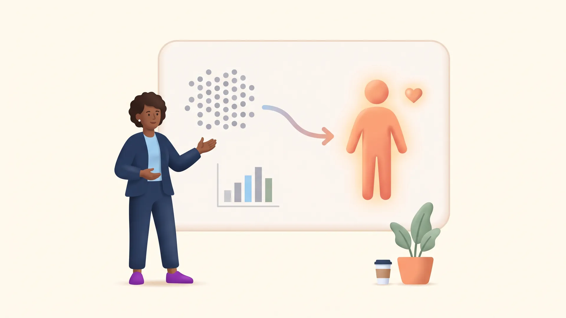
To make big impact numbers feel real to donors, shrink the scale to a single story, anchor the figure to something familiar, and pair the emotion with credible proof. One vivid example moves people more than a giant statistic ever will.
Your organization did something remarkable this year. You served tens of thousands of people, or delivered a million meals, or planted a hundred thousand trees. So you put that number in your appeal, in bold, and waited for the gifts to roll in.
They did not roll in. And it is not because donors do not care. It is because big numbers, on their own, do not make people feel anything. If you want to know how to communicate your nonprofit's impact to donors, the counterintuitive truth is that the bigger your number, the harder you have to work to make it land.
The good news: this is a fixable communication problem. Below are five concrete techniques to turn impressive-but-cold statistics into stories that actually move people to give. None of them require you to shrink your impact. They just require you to translate it.
Why do big impact numbers fail to move donors?
Because human empathy does not scale the way spreadsheets do. This is one of the most consistent findings in the psychology of giving, and once you see it, you cannot unsee it in your own communications.
In a well-known experiment, researchers asked people to donate to fight hunger. One group saw a story about a single, named child. Another saw statistics about millions of people in need. The group that met the one child gave $2.83 on average, more than double the $1.17 given by the group that saw the statistics. Same cause, same need, but the number actually suppressed generosity.
It gets starker. Researchers call the fade in feeling "psychic numbing," and it starts almost immediately. One study found that donations and compassion begin to decline as early as the shift from one victim to two. By the time you reach a million, the number has become an abstraction the brain files away instead of feeling.
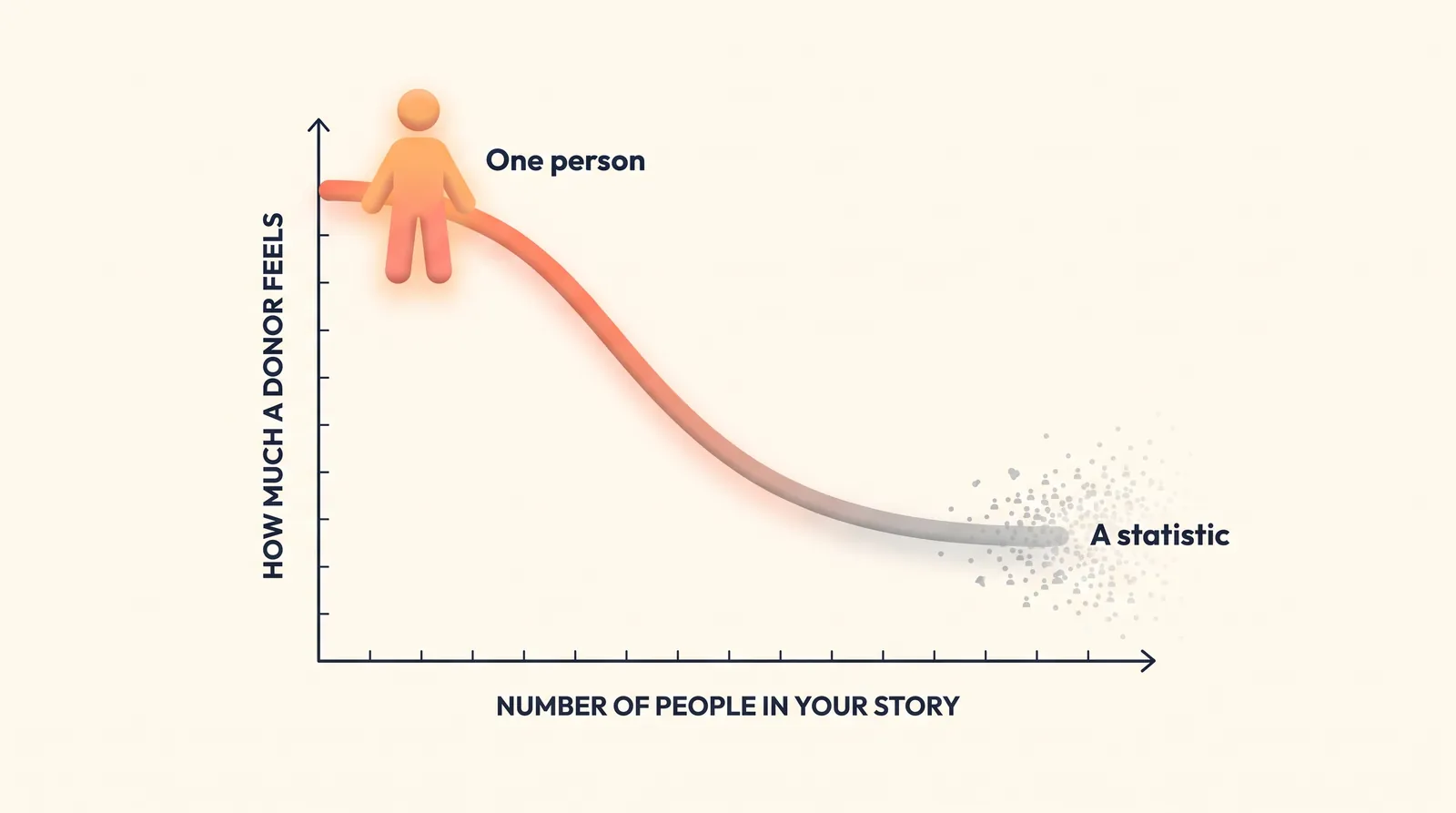
So the instinct to lead with your most impressive figure is working against you. The fix is not to hide the number. It is to give the donor a way in.
How do you turn a big number into a single story?
Start by doing the opposite of what feels natural. Instead of scaling up to your grandest total, zoom all the way down to one.
Pick a single, representative story that sits behind the statistic, then let the big number play a supporting role. The story creates the feeling. The number confirms the scale.
Before: "Last year, we provided 1.2 million meals to families across the region."
After: "Last winter, a mother named Renata stopped skipping dinner so her two kids could eat. Then our pantry opened three blocks from her apartment. She is one of the families behind the 1.2 million meals we served last year."
Same statistic. But now it belongs to someone. The donor feels Renata first and grasps the scale second, which is exactly the order that drives giving. Use an invented-but-realistic example if you have to protect privacy, and always get permission before sharing a real person's story.
How do you make scale tangible with a comparison?
Sometimes the number itself is the point. Your scale is genuinely part of the story, and you do not want to bury it. In that case, do not just state the figure. Anchor it to something the donor can already picture.
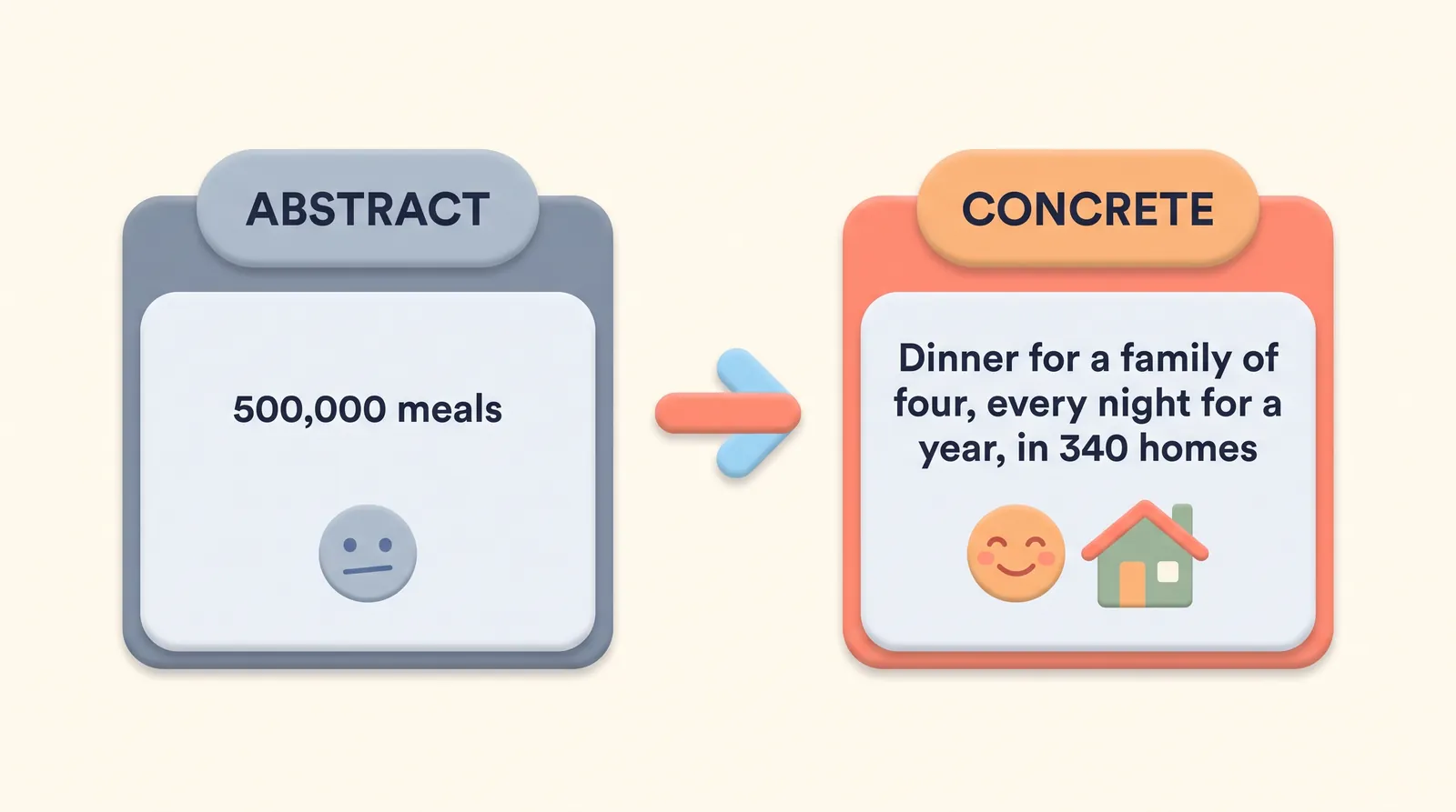
A raw number lives in the abstract. A comparison drops it into the physical world, where the brain can actually hold it.
- Translate to a unit of one. "500,000 meals" becomes "a hot dinner for a family of four, every night for a year, in 340 homes."
- Borrow a familiar object. "80 tons of supplies" becomes "enough to fill six school buses, parked end to end."
- Convert to time or distance. "12,000 hours of tutoring" becomes "the equivalent of one child getting help every school day for 66 years."
The rule of thumb: if a donor cannot picture it, they cannot feel it. A good comparison does the picturing for them.
How do you show impact when you cannot show a beneficiary?
Plenty of organizations sit one step removed from the people they help. You might fund research, move resources, train other nonprofits, or protect a habitat. You do not have a photo of a grateful face, because the face is downstream of your work. That is one of the hardest impact-communication challenges there is, and it has a solution.
When you cannot make a beneficiary the hero, make the mechanism the hero instead. Show the donor the ingenious, tangible thing your organization actually does, and let them feel the leverage of it.
Three moves work well here. First, dramatize the process: walk the donor through the clever chain of events their gift sets off, step by step. Second, borrow the beneficiary story from a partner at the end of your chain, with their permission, and credit them. Third, quantify the leverage, because efficiency can be its own emotional hook ("every $1 you give moves $8 worth of supplies"). Our guide on fundraising around intangible outcomes goes deeper on this exact problem.
How do you back the story up with proof donors trust?
A vivid story opens the door. Credible evidence is what keeps a donor from wondering whether their money actually did anything. And that doubt is real: only 18.3% of Americans report high trust in charities, even though 67.7% say trusting an organization is essential before they give.
Donors are not just moved by impact, they are increasingly asking to see it. When one study gave donors clear, comparable impact information at the moment of decision, the share who chose the most effective option jumped by 80 percent, and 74 percent said a standard way to compare impact would help them decide.
So pair every emotional story with a specific, verifiable result. Name the outcome, not just the activity. "We ran 40 workshops" is an activity. "82% of participants found stable housing within six months" is an outcome, and it is the sentence that earns trust. This matters more every year, because donors are getting harder to keep: the number of donors fell 4.5 percent in 2024, the fourth straight year of decline. Proving impact is how you hold on to the donors you have.
How many numbers should one message include?
As few as possible. Ideally, one.
When you stack five impressive statistics in a single appeal, you are not building a stronger case. You are re-triggering the same numbing effect that made the first number fall flat, and you are asking the donor to rank importance you should have ranked for them. Every extra figure dilutes the one that mattered.
Pick a single hero number for each message and cut the rest, or move them to a place where a curious donor can dig deeper later. Then give that one number the full treatment: a story to feel, a comparison to picture, and an outcome to trust. A good rule for your next appeal is one face, one number, one ask. Restraint is not underselling your impact. It is the only way a donor can actually hold on to it.
What does this look like in your actual donor communications?
Techniques are only useful if they survive contact with your next email. Here is how to put all five to work across the communications you are already sending.
- Appeals: Open with one story (technique one), state the scale with a comparison (technique two), and close with one verifiable outcome (technique five). Lead with the person, not the total.
- Thank-you messages: Show this specific donor what their specific gift made possible. "Your $50 stocked one family's pantry for two weeks" beats "thank you for supporting our mission."
- Annual reports and impact updates: For every headline number, add a translated version right beside it. Never let a big figure stand alone on the page.
- Social posts: One face, one number, one comparison. That is the whole formula, and it fits in a caption.
The through-line is relevance. The more you know about what a specific donor cares about, the more precisely you can choose the story and comparison that will land for them. This is where a connected system earns its keep. DonorDock's donor timeline keeps every gift, note, and interaction for each supporter in one view, so you can tailor the story instead of blasting the same number to everyone. And when it is time to send, DonorDock's email and outreach tools let you deliver the right version to the right segment without stitching tools together.
Choosing the right story for the right donor is the heart of good stewardship, which is exactly what our approach to donor outreach is built around. For a closely related take on why narrative tends to beat raw data, read why story beats stats in today's donor decisions, and if long impact reports are your struggle, how to show donors the impact without a 20-page report pairs well with this piece.
Your impact is big. Make it feel that way.
The size of your impact is not the problem. The way most of us present it is. A number by itself asks the donor to do the emotional work of imagining what it means, and most people will not.
Do that work for them. Shrink the scale to one story, anchor the figure to something they can picture, make your mechanism the hero when you have to, and back it all with proof. Do that, and the same number that used to slide past donors starts to stop them in their tracks.
If you want a single place to know your donors well enough to tell each of them the right story, see how DonorDock works.